
Caught in the Spokes —
Art Direction, Illustration
Caught in the Spokes is a film by Vancouver-based director Rana Soleil. The film is a playful and ridiculous comedy that centres around two budding lovers mourning the loss of their bike and cat.
I was brought on to create illustrations for the poster. (The typography and logo had already been created.)
We wanted the poster to be eye-catching and reflect the playful nature of the film.
To reflect whimsicality, I used a blend of exaggeration and implausibility — in abstracted shapes, steep hills, caricatured facial features and emotions.
The logo given to me.

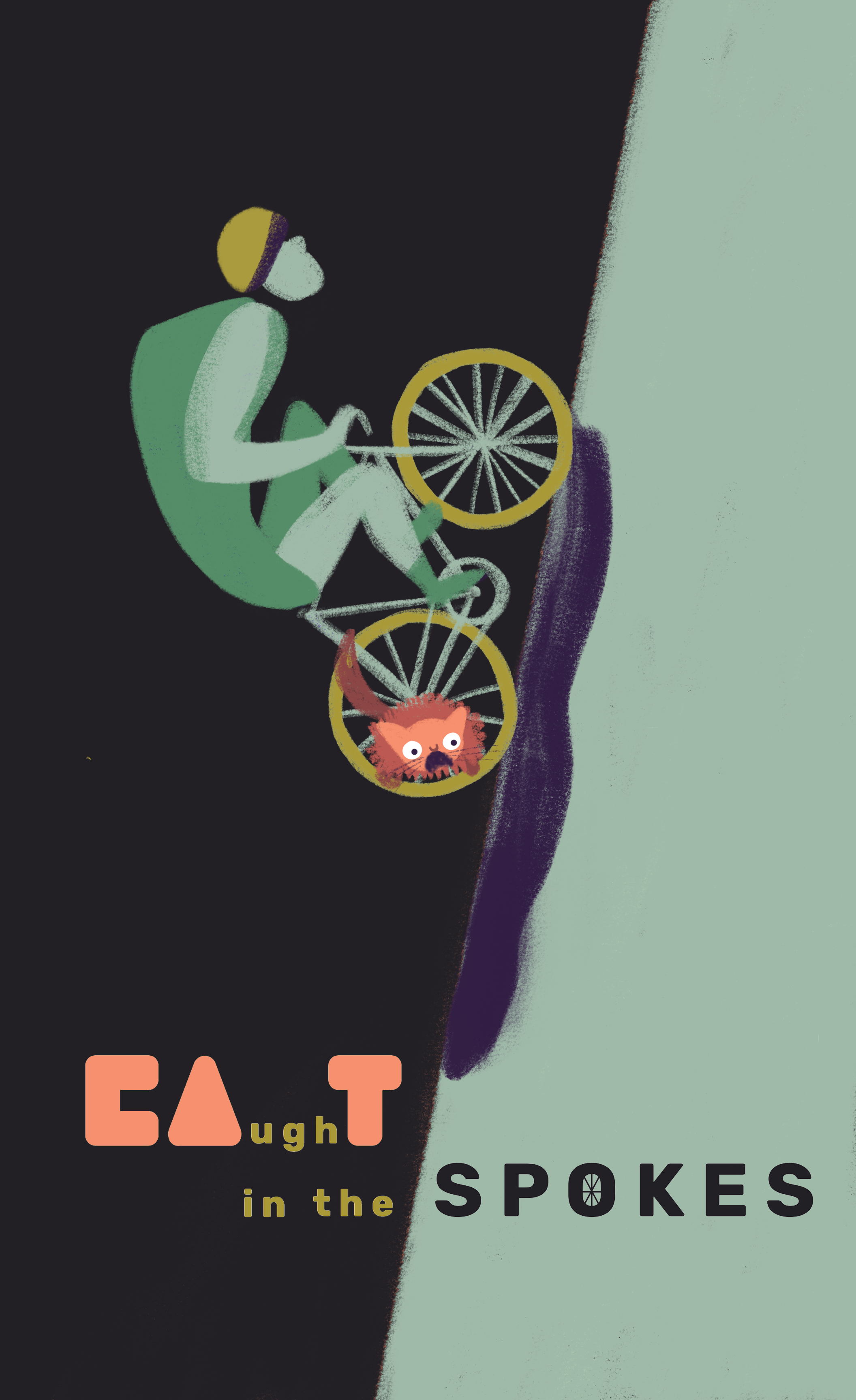
The final illustration I made, incorporating a whimsical feel and colours from the logo.
Since the story centres around the unintentional and chaotic collision of the two lovers' lives, we decided, for the movie poster, to create an illustration of a collision between a biker and cat, with the cat caught in the spokes of the bike.
The poster draws viewers to the orange cat and bike collision.
Process
When I’m initially brought on to any project, I usually start by talking with the client, understanding the project, doing any research relevant to the project and design. With Rana, it was especially fun and eye-opening to watch scenes from her film and learn about her filmmaking process. I usually let the client send me a general mood board, to better understand their visual style and what they're looking for.
I then create rough sketches to test ideas for different directions.

Several different rough ideas for the poster illustration. I refrain from going too much into detail and fidelity, as we're testing out the idea and direction.


After talking to the client and getting approval on a direction, I then go into more detail with the design. We wanted the cat to be caught in the bike spokes, and also show the entire bike.
One of the first few iterations of the poster. A rougher illustration, as I was testing out the idea to be approved: specifically, now with colours and shape, and whether they created a unified feel.

The composition direction works in creating balance, so I refined details and made the artistic style and textures more consistent throughout the poster.
• To indicate and emphasize the collision of stories (bike + cat), we relocated the cat to the front spokes.
• To make the illustration more expressive and light-hearted, I added eyes on the biker. This also reduces the intensity and emphasis on the intense biking, and rather, helps highlight the absurd nature of the situation.
We generally liked the illustration at this point, especially with the biker and cat on the left, but the purple shadow on the right seemed out-of-place and unrecognizable as a shadow. Here, I experimented with a few shadow studies.

A shadow study: does abstracting the shape make the shadow more recognizable?

Another shadow study: does matching the colour to the green hill make the shadow look more convincing? How about a simpler shape?

Another shadow study: how about refining the shadow?
I also added subtly hidden hearts in the shadow, to match the film's love story. We ended up liking this version the best.

The final poster, with movie credits added.