
UI Refresh for Online Finance Education (EDIT LATER)
CFI Education
Team:
Flo (UI/UX Designer)
Bettsina (Design Lead)
Gwyn (Developer)
Role:
UI Design, Style Guidelines, Branding, Design System
Tools:
Figma
Problem Space
When I joined CFI as their second designer, the design culture was still quite young. The focus was more on quickly producing products and content, to validate business ideas, rather than fully refining designs. As a result, the site was constantly changing and had inconsistent design styles.
As our company grew, we needed a system to establish and elevate the style of our past, current, and future UI designs.

Enter CFI 3.0
To help establish brand trust, ensure visual consistency and facilitate the communication between designers and developers, we decided to work on a component-based design system.
I consolidated different components throughout the site— and worked with our lead designer to cut down on inconsistent styles and establish specific guidelines.
Our design system right now is a living design system, a bridge between designers & developers. It’s sped up our workflow immensely.
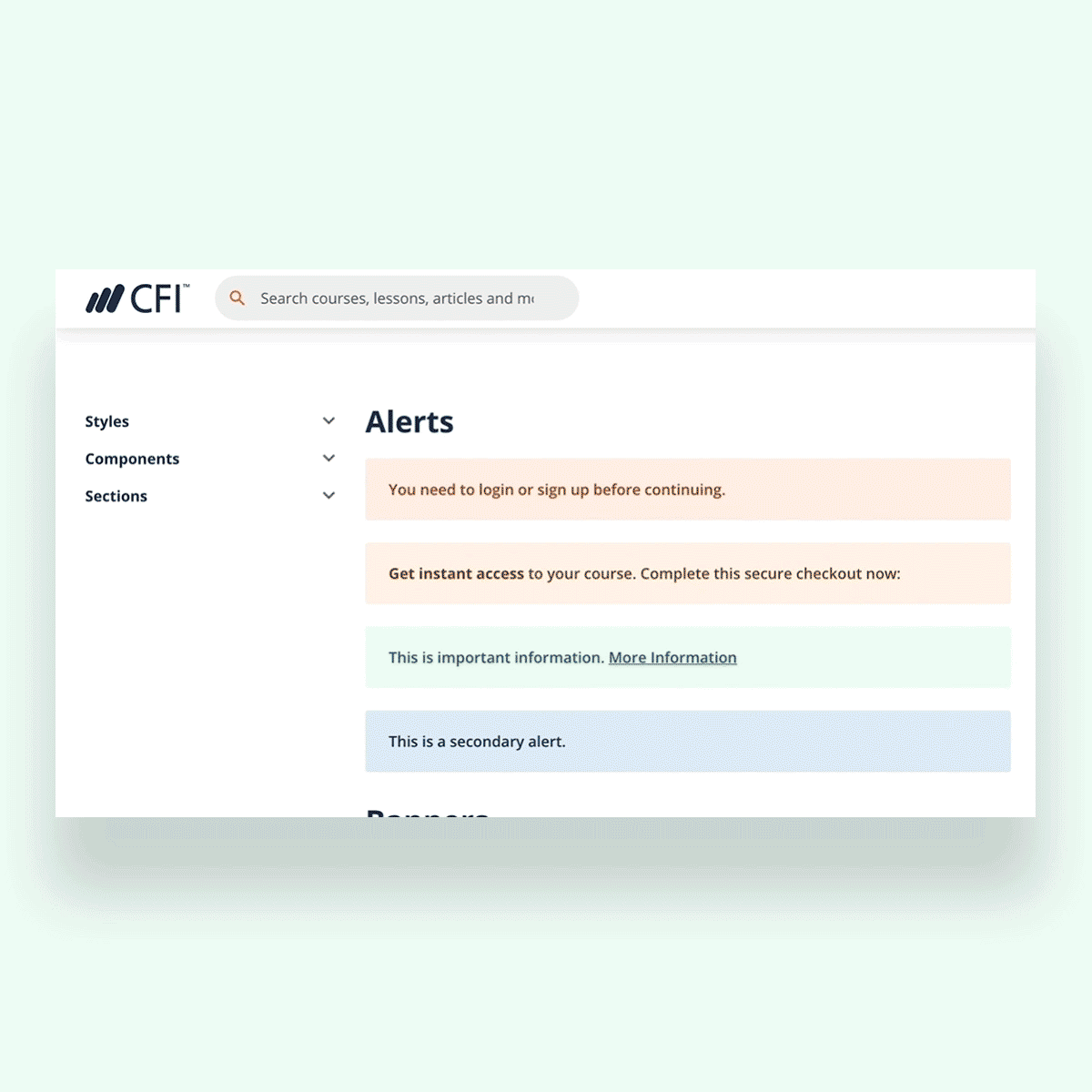
Here is a sample of our design system.

A Few Highlights —
Spacing/Margins
I helped establish an 8pt grid to create consistent spacing in UI displays. The 8pt grid then defines our dimensions, padding, and margins of both block and inline elements.
We then created specific spacing options, to have more consistency and eliminate arbitrary decisions. Collaborating with our lead designer, and communicating with our developer, I built out rules and guidelines for specific sizes, as well as use cases for each margin or padding.
These guidelines would also be defined in the code to reduce coding time.


Typography
We refined our typography to a few select header and paragraph sizes, and included usage guidelines.


Going atomic—design systems should be atomic enough to be flexible.
Cards
Cards are something we use across the site. I had the most fun doing this— I gathered all the card designs we used, and established specific anatomies and guidelines for consistent use of text styles and spacing. It was satisfying refining them so they were all more visually cohesive.

BEFORE: Our older card styles.

AFTER: With new styles updated. We have subtler shadows, more consistent padding, clearer photos with no blue overlay — creating a roomier, friendlier design that’s inviting to interact with.


A few other snippets.


Impactful Results
Since building out our design system, we’ve had amazing results for our team:
Increased design productivity.
Designed components are consistent and reusable.Facilitated communication between designers.
UI design inconsistencies are more readily apparent, and we can refer to the Design System to decide on the best method of approach.Improved communication between Designers & Developers.
Developers are now working on refactoring our website’s code so the components can be as modular as the designs.
Overall Takeaways
Start atomic, then build up.
Before working on larger components or even pages, start with decisions from an atomic scale. When you have a solid foundation of building blocks, it’s much easier to align on complex components later on.Design systems are interconnected and complex.
The end results have a sense of straightforward simplicity, but it’s a winding process to get there. Lots of experimentation, discussion, and, most importantly, ensuring visual cohesion between everything.
Everything is connected—for instance, refining designs for cards may impact spacing guidelines, which would then change designs for anything that’s impacted (input forms, hero sections, etc.).Design systems take a lot of time and effort upfront — but saves us time and effort in the long-term.
Working on this design system gave our team immense value. It not only improved our UI but also improved our process and communication within the Design & Development team.
I highly recommend establishing a Design System, even with a Design team as small as two designers.
Thanks for reading!
Related Projects:

Re-thinking Site Navigation for Online Education
Evaluating site structure and navigation for user simplicity.